Design Takeaways: logos
February 15, 2024This is the fourth article in our series of tips for designers and aspiring designers, Design Takeaways, which brings you practical insights into how to improve your design skills and resources you can put to use.Access the other posts here.

Logos serve as the visual representation of a brand or company, which means they need to quickly and effectively convey the essence of the brand and be memorable. It’s no small job, which is why logo design is so important.
As with any other graphic design element, great logos tend to be built on foundational design principles, including balance, proportion, contrast, andcolour theory.

Beyond this, they need to incorporate a proper understanding of the company or brand they will represent, which means designers need to do their research before embarking on creating a logo.
Canva notes that, ideally, a logo willpresent a brand to an audience while also differentiating it from the competition. It will be packed with meaning and perfectly communicate the industry, services, demographic and values of a company so that consumers can speedily decide if it’s for them.

Logos need to reflect a brand’s purpose and personality. This needs to be factored into every aspect, from thetypographyto the colours. It also needs to be versatile enough to be used in different platforms and sizes, from stationery to large-scale signage. It therefore needs to be simple enough to scale well too.

Designing a logo from scratch is more than creating an eye-catching icon – it’s a thorough process of developing a visual representation that will reflect everything a brand’s target market needs to know about it at a glance.
This is why changing a brand is such a big deal. Designers are often told that the best brands should never change their logos because they are clearly effective and recognisable.
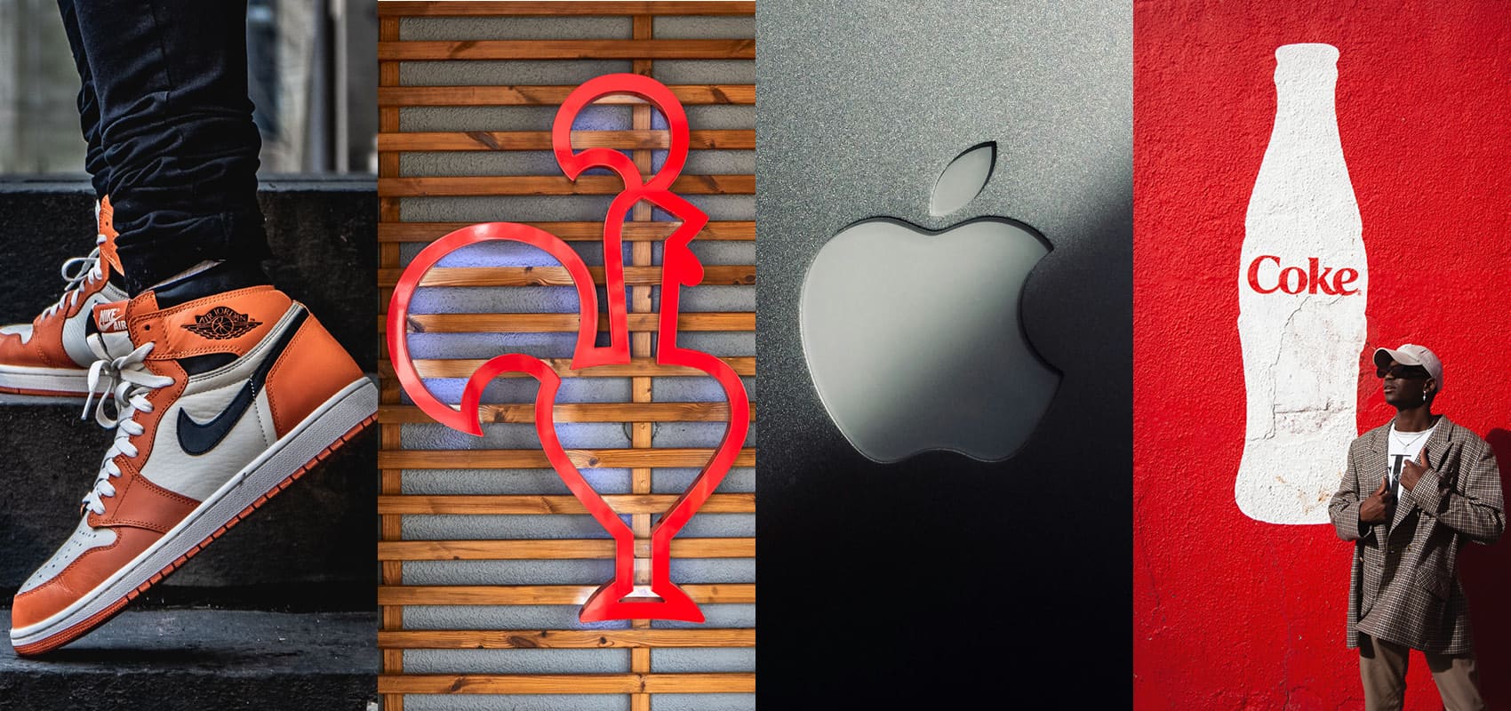
However, if you look at the history of some of the most famous logos – Google, Apple, Coca-Cola (ahem, Nando’s) – you’ll see that they have evolved, even if subtly, over time to remain relevant.

For example, one of the latest trends in logo design is responsive logos.
Link to this headingWhat are responsive logos?
Responsive logos are logos that are designed to adapt and respond to different contexts, devices, and screen sizes. With the rise of digital platforms and the variety of devices we use to access content (such as desktops, laptops, tablets, and smartphones), it’s essential for logos to maintain their visual impact and readability across various mediums.
Responsive logos are therefore designed for scalability, adaptability, simplification, and flexibility… without compromising consistency.
VistaPrintexplains it as follows:Responsive logos are shape-shifting logos that change in size, complexity or even colour to accommodate and adapt to wherever they are placed.
Adding to this, they note that although the term responsive is largely used in digital applications (e.g. the way a website displays on your desktop compared to on your phone), the idea has been around much longer:
Over the last century, companies have experimented with different “contextual” logos to suit a specific location or print medium. Sometimes companies drained the color from their logo for black-and-white newspapers. Other times they shrunk and simplified their logo to appear on promotional pens. Or often they added more flourishes and decorations for an impressive letterhead.

For example, at Nando’s, you’ll see that we have different versions of our logo for different applications. We use our name and typography on our restaurant store fronts and billboards (which allows for easy recognition on the go), but our name plus our icon (his name is Barci) on other platforms, like our website. Sometimes, depending on the format, Barci is above the name and sometimes he’s next to it. Sometimes, we use him on his own.
We even have versions of Barci for our art, music and design programmes. And – being an always-current kinda guy – he’s also had the occasional style edit to make sure he stays suave.

Link to this headingLogo design resources
If you’re keen to learn more about logo design or try your hand at it (or you’re looking to improve your existing skills), here are some resources to consider:
- Vistaprint logo design guide
- Instagram posts from @itsabiconnick:
- Instagram post,Don’t design a logo before reading this post, by @logobrainy
- Instagram post,Logo redesign fails, by @logomotivations
We’d love to hear your logo tips too! Share with us on Instagram, @NandosCreativityOfficial.