Design Takeaways: colour
January 12, 2024This is the third blog post in our series of tips for designers and aspiring designers, Design Takeaways, which brings you practical insights into how to improve your design skills and resources you can put to use. Check out the first blog post onUX basics, and the second one ontypography and fonts.
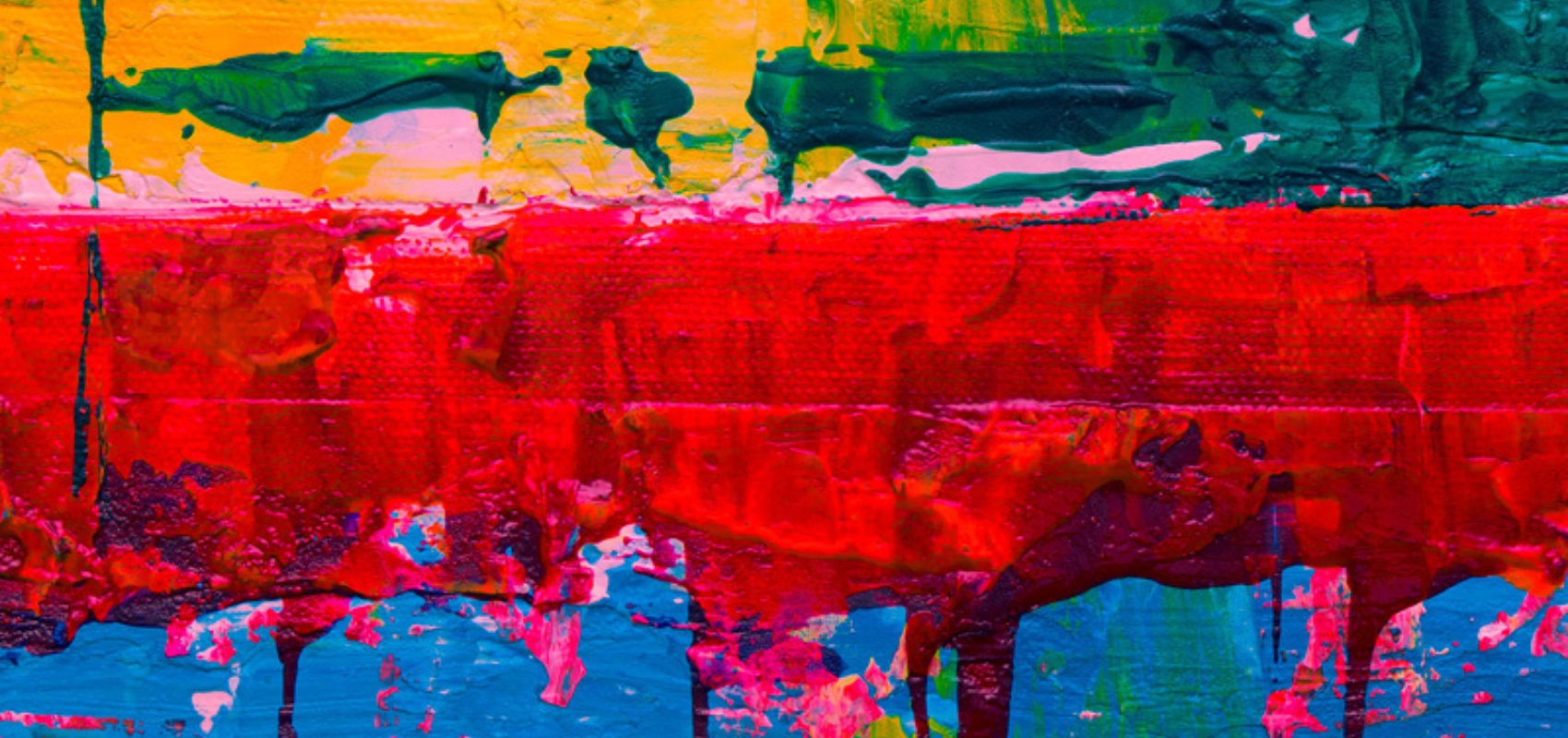
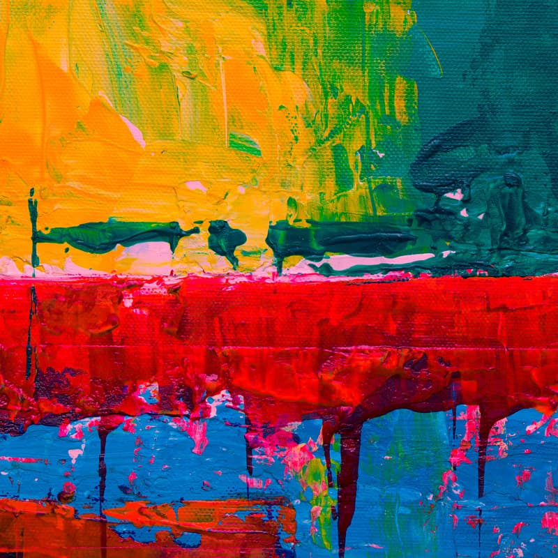
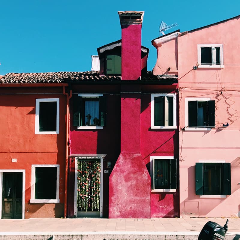
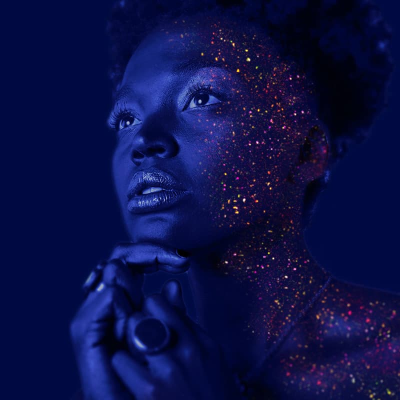
In this article, we’re looking at colour. It’s one of the most important aspects of design and can help to convey emotions, create mood or improve (or reduce!) visual appeal.
Link to this headingWhat is colour?
Colour is created by light being reflected or emitted from things. AsPantone explains,To see colour, you have to have light. When light shines on an object some colours bounce off the object and others are absorbed by it. Our eyes only see the colours that are bounced off or reflected.

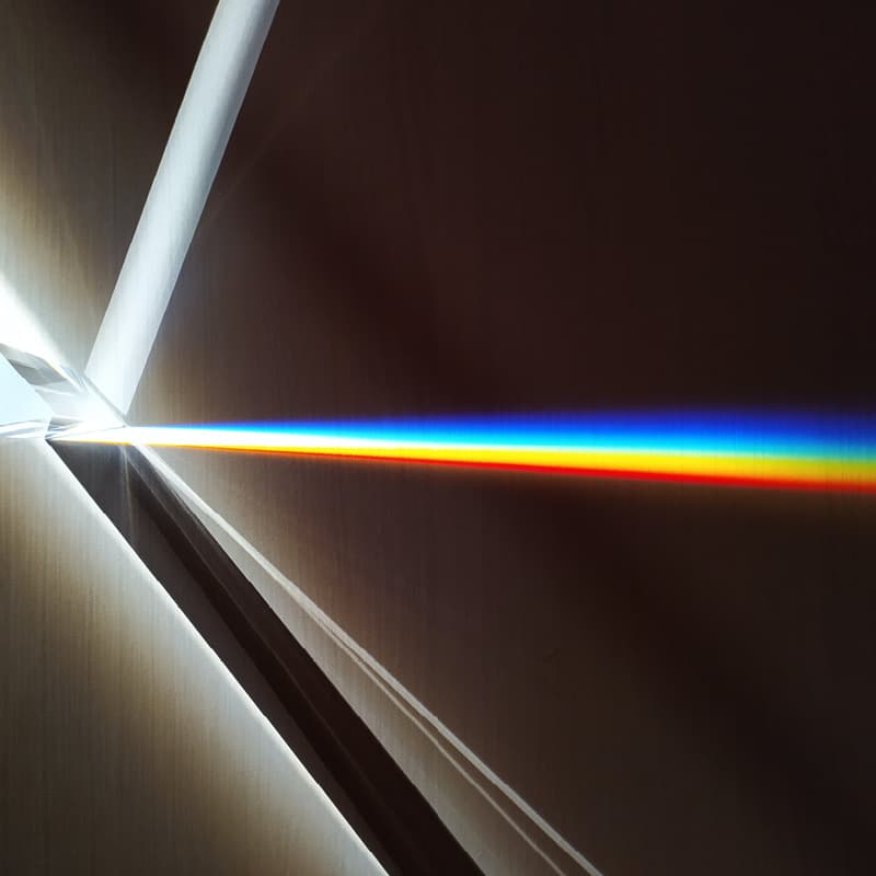
White light is made up of seven main colours: red, orange, yellow, green, blue, indigo and violet – the colours of the rainbow. When you see a rainbow, you are essentially observing the separation of white light into its individual colours.
At school, most of us are taught that there are three primary colours – red, yellow and blue – and that by combining them, you can create secondary colours – orange (red + yellow), green (yellow + blue) and purple (blue + red). Tertiary colours can be produced by mixing a primary and a secondary colour.
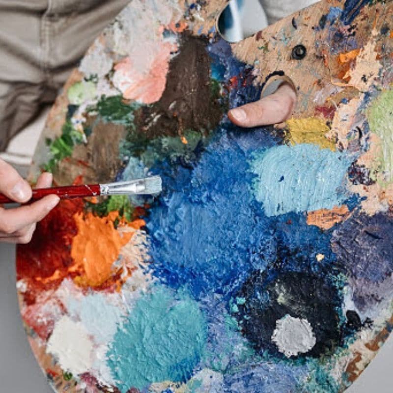
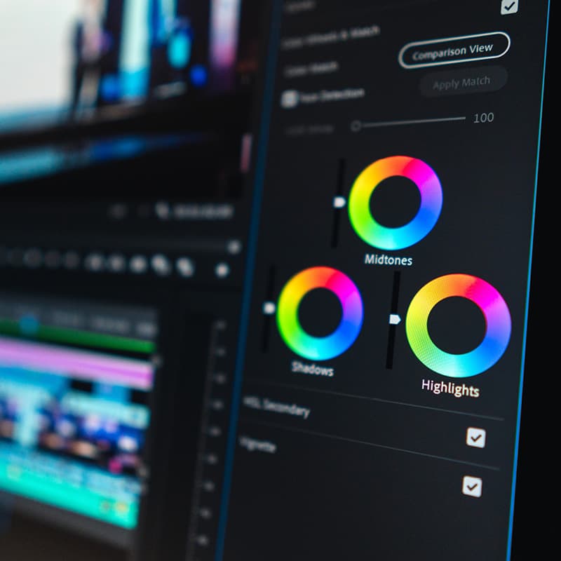
While this traditional colour theory works when mixing colours for painting, designers work with colour differently and work with two colour methods: additive and subtractive.
Link to this headingAdditive vs. subtractive colours
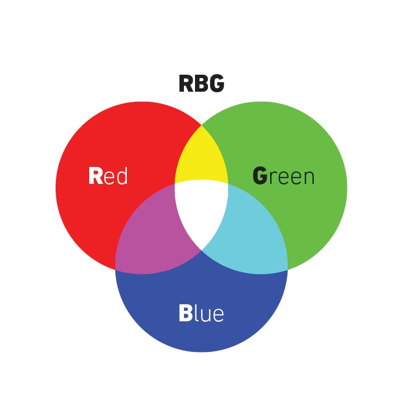
Additive colours are created by mixing two or more coloured light sources together. The RGB colour system, which is used for digital displays, such as computer monitors, television screens, and cameras (where light is emitted to create images), is an example of additive colour. It stands for Red, Green and Blue and combines these primary colours of light in various degrees to create a variety of different colours. The more intense each colour is, the closer you get to white light. Combining all three colours at full intensity produces white light.
Subtractive colours, on the other hand, are created by completely or partially absorbing certain light wavelengths and reflecting others. Pantone explains that these colours begin as white and as you add “filters” to the white light, such as ink, this white light takes on the appearance of colour.
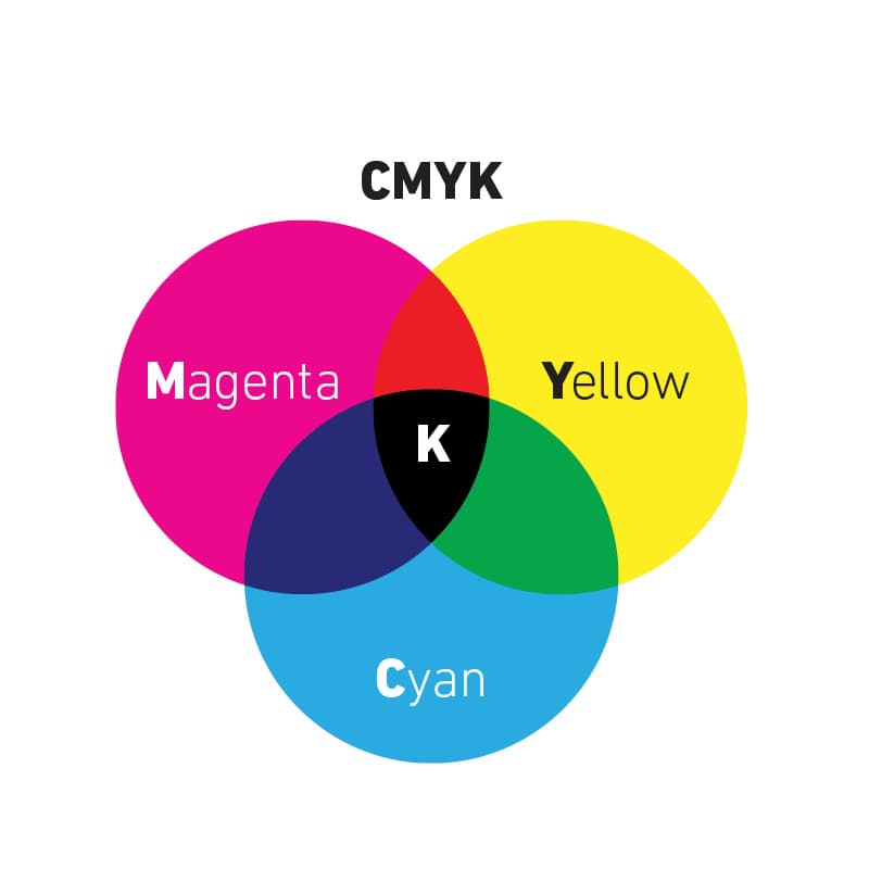
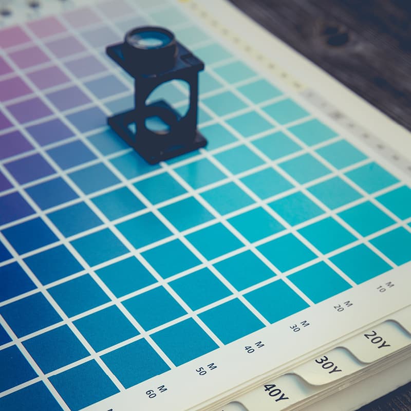
CMYK is an example of a subtractive colour model. It’s used for printing, especially in full-colour publications like magazines, brochures, and posters. CMYK stands for Cyan, Magenta, Yellow, and Key (black).

Instead of emitting light, CMYK works by subtracting colour. The colours are applied in layers of ink or toner. cyan, magenta, and yellow are the primary colours, and black (key) is added for depth and to improve the richness of dark colours. As more colours are added, they absorb light, and the result approaches black.
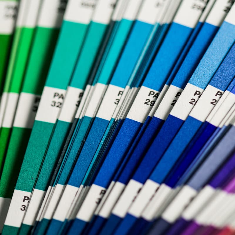
Link to this headingColour properties
Colour properties refer to the characteristics that define and describe the visual aspects of colours. They include:
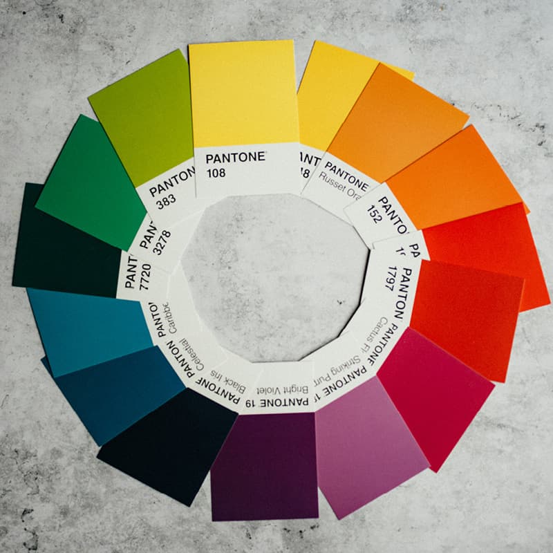
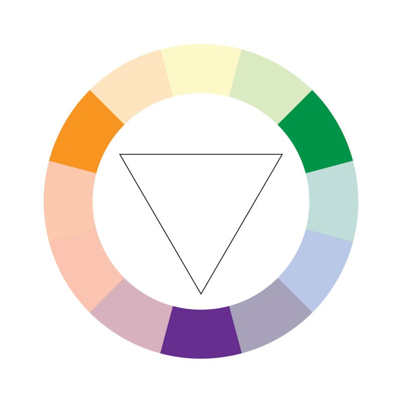
Hue: The type of colour. It distinguishes one colour from another on the colour wheel (a tool used in art and design to show colours and their relationship to each other), for example, red, blue, and green are different hues.
Saturation: Also called chroma or intensity, saturation refers to the vividness or purity of a colour. A highly saturated colour is vibrant, while a desaturated colour appears more muted or greyish.
Brightness/lightness: This property represents the amount of light in a colour. Brightness is often used to describe how light or dark a colour appears. For example, an overexposed photo is much brighter because it has a lot of light in it.

Tone/tint/shade: Tone refers to a colour’s relative lightness or darkness. Tint is a colour mixed with white, making it lighter, while shade is a colour mixed with black, making it darker. For example, you can tint blue to make it lighter or add tone to make it darker.
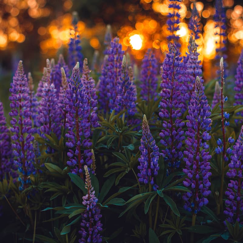
Colour temperature: This describes whether a colour appears warm or cool. Warm colours have a red or yellow undertone, while cool colours have a blue undertone. For example, a burgundy (red wine) red is cooler than a Christmas red.
Complementary colours: Complementary colours are pairs of colours that sit opposite each other on the colour wheel. For example, the complementary colour of yellow is purple.
Analogous colours: Analogous colours are groups of colours that are next to or near to each other on the colour wheel. They usually match well and create serene and comfortable designs. For example, blue, turquoise and green are analogous colours.
Triadic colours: Triadic colours are sets of three colours that are evenly spaced around the colour wheel. This creates a vibrant and balanced colour scheme. Orange, green, and purple form a triadic colour scheme.
Link to this headingColour psychology
Colours can create mood or inspire an emotional response, which makes them an important tool for designers. For example, this very useful post on colour combinations fromOberlopoints out the feelings colours can generate in people:
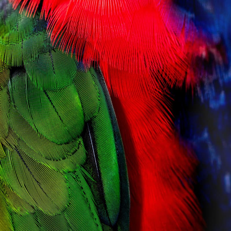
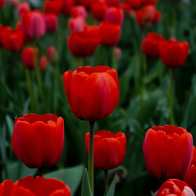
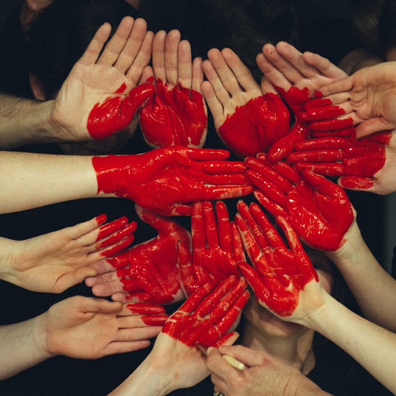
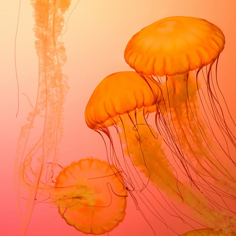
Red: excitement, danger, energy, courage, strength, anger
Orange: creativity, enthusiasm, health, happiness, encouragement, balance

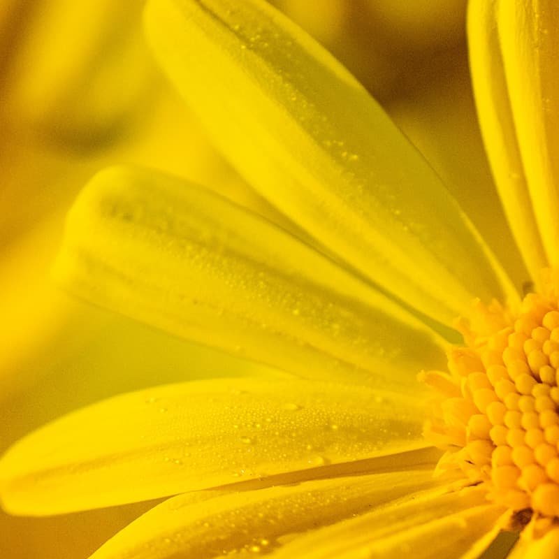
Yellow: sunshine, hope, optimism, light, positivity, freshness

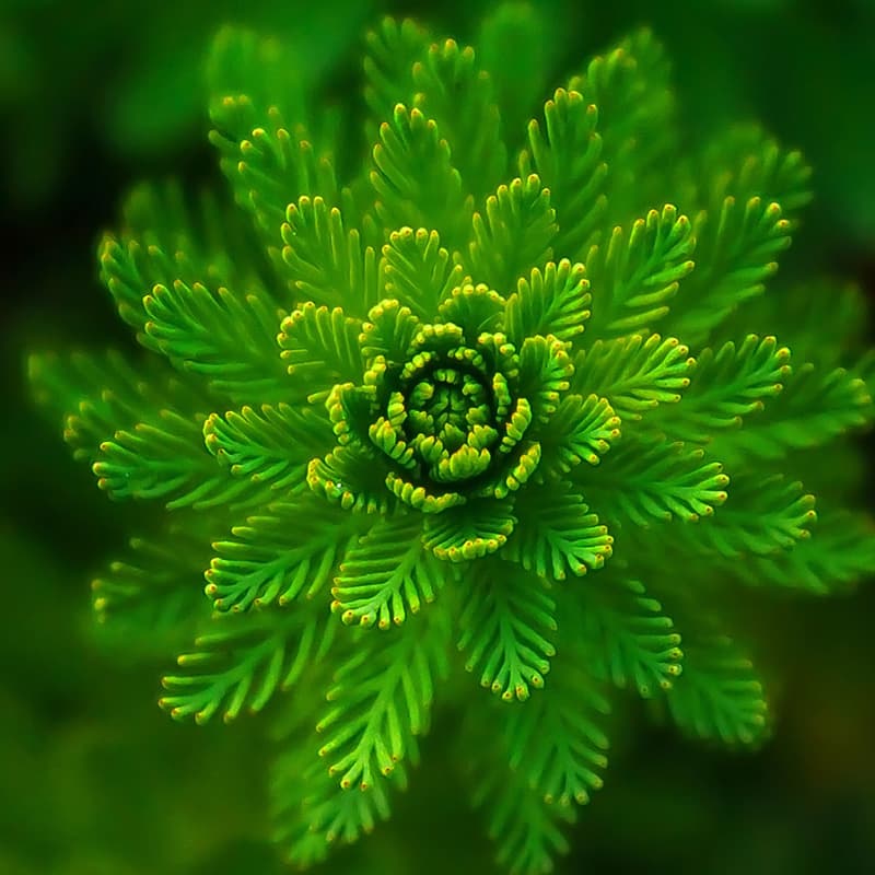
Green: health, nature, renewal, generosity, freshness, environment
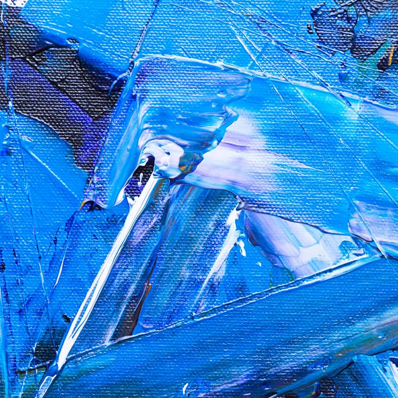
Blue: freedom, trust, expansiveness, dependability, faith, inspiration

Purple: royalty, luxury, power, pride, creativity, mystery
Link to this headingColour resources for beginner designers
Here are a few resources that may help you in your journey with improving how you use colour as a designer:
Pantone Color Fundamentals series: covering everything from what colour is to how colour is reproduced, this series of articles includes lots of visuals and examples. Check it outhere.
Zeka guide: How To Use Color Theory in Graphic Design, covering basic colour theory
- YouTube colour tutorials:
- Color Theory for Beginnersby Envato Tuts+
- Color theory for designers | How to use color in designby Monica’s Design Process
- Beginning Graphic Design: Colorby GCFLearnFree
- Insta accounts that share helpful colour theory advice and tips (among other design topics):
- @color.palette.studio(also worth visiting the website for the helpful freebiespage)
- @mehuldesign, specifically theConquering Colors In UIseries
- @redonadida, for example this post onhow colours persuade people
- @thewahab.co, for example, this post oncolor in UI designor this one ontime-saving color tools.
- Pantone Fashion Color Trend Report Spring 2024
We’d love to hear your colour tips too! Share with us on Instagram, @NandosCreativityOfficial.